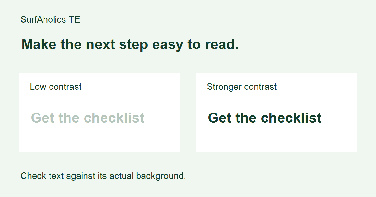
Before sending visitors from SurfAholics TE to a landing page, check whether they can read its essential text against the background. Color contrast is the difference in lightness between those colors. A faint button label can hide the next step even when the offer itself is clear. Here is a repeatable check you can record before promoting a page.
Make a short list of text and backgrounds
Start with the headline, body copy, links, signup instructions, button labels and error messages. Include small conditions beneath a claim. For each item, note the text color and the background immediately behind it. Check the actual published page; a design preview can differ from the final theme or mobile layout.
Measure each pair rather than guessing
Use a contrast checker that accepts foreground and background color values, such as a browser developer tool or the tools linked in the W3C contrast guidance below. Enter the actual colors used by the page and record the reported ratio. If text sits over a gradient or photograph, test the least contrasting area behind the letters, or move the text onto a solid background.
For ordinary text, WCAG 2.2 Level AA uses a minimum contrast ratio of 4.5:1. The threshold is 3:1 for large text: generally at least 18-point regular or 14-point bold. These text rules have exceptions, including logos and incidental text; they do not replace the separate checks needed for controls, focus indicators or other visual information. A passing color pair alone does not establish full accessibility.
Improve a weak label without changing its meaning
Imagine an active signup button with pale gray words on a white background. Darken the label or change the background, then measure the new pair. Keep the same clear wording, such as “Get the checklist,” so you can judge readability without also changing the offer. Do not rely on increasing saturation: a brighter hue is not necessarily higher contrast.
Check ordinary links and their hover or focus presentation as well. Visitors should be able to recognize a link without color being the only clue; an underline can help. For forms, keep a visible label and a useful text error message instead of identifying a problem only with a red border.
Recheck on a narrow screen
Open the page on a phone or a narrow browser window. Make sure text has not moved over a different part of an image and that important instructions remain visible. Enlarge the text, navigate the form with a keyboard, and review the page in normal lighting. These practical checks complement the measured ratio; they do not replace it.
Keep a small verification record
Record the page address, date, element, text color, background color, measured ratio and change made. Recheck after theme, button or image updates. Prioritize the primary action and essential conditions, then work through the remaining text. A clearer page gives visitors a fairer opportunity to understand the offer, but it cannot guarantee signups or sales.
For definitions, exceptions and testing resources, consult W3C’s explanation of Contrast (Minimum). For the broader writing and layout review, see our landing-page readability guide.