Before assigning banner impressions on SurfAholics TE, check the finished advertisement at the size and destination your visitors will actually encounter. This traffic exchange banner checklist is an acceptance test for a ready creative: can the image display correctly, communicate one useful promise, and take an interested person to the right place?
Inspect the actual display size
Open the exported banner at its intended dimensions, without enlarging it to read the copy. Can you recognize the offer and action in a brief glance? If the words only work when zoomed in, shorten the message or simplify the layout. Check the smallest essential wording, including any condition that changes the meaning of the offer.
Use the current placement requirements in your member account to confirm dimensions, file format, file-size limit and animation rules. Regular banners and square placements may have different requirements. This guide does not substitute a guessed size or upload limit for the platform’s current instructions.
Check one promise and one next step
Write the banner’s promise in a single sentence. Then compare that sentence with the exported image. Does the creative say who it helps and what the visitor can do next? Remove unrelated offers, unsupported superlatives, fake urgency and any claim the destination cannot support.
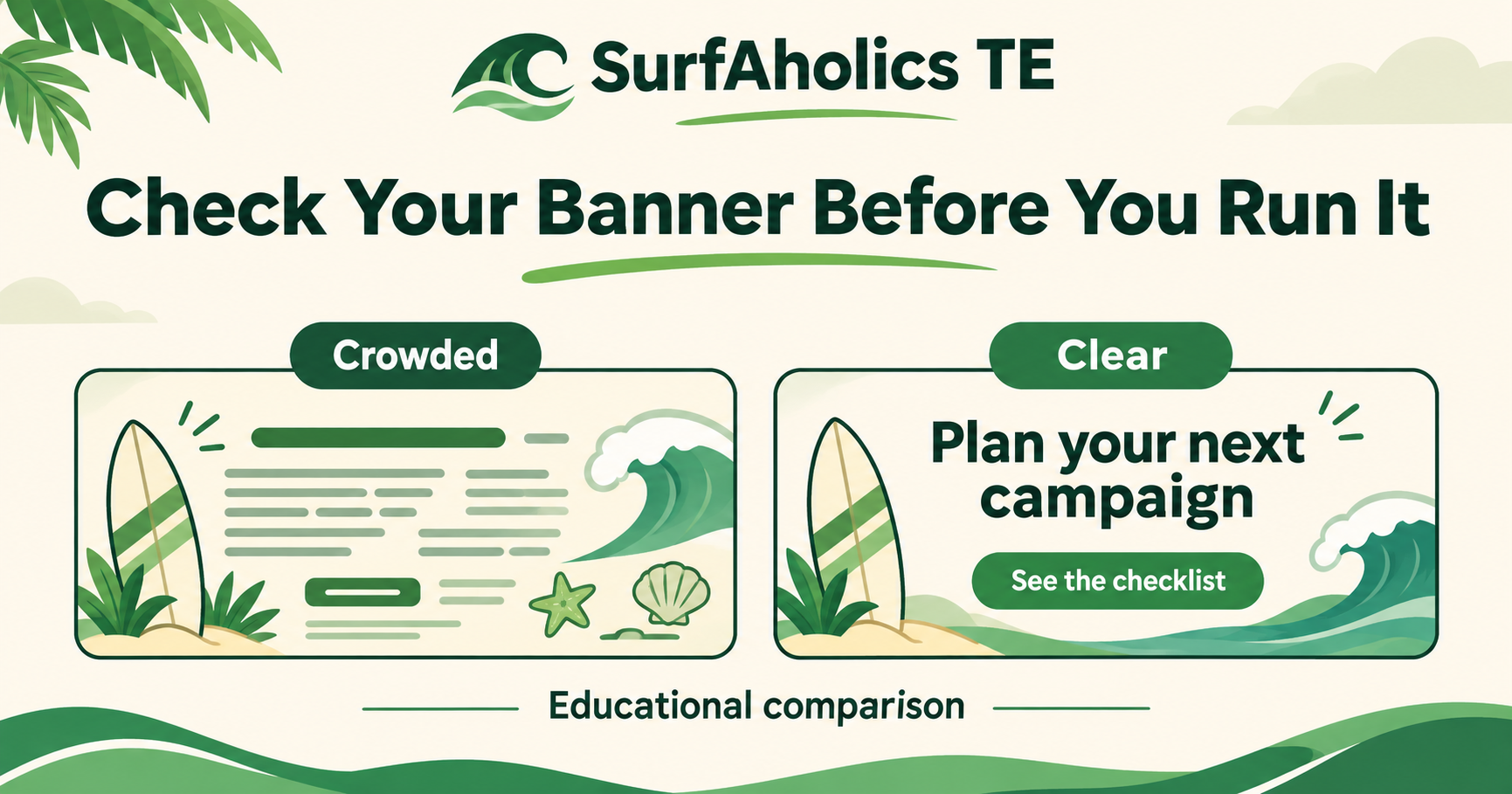
For a hypothetical example, a crowded banner might combine a contest, an income claim, three logos and several tiny buttons. A clearer version could say “Plan your next campaign” with one action: “See the checklist.” The second version makes a narrower, testable promise. This example illustrates clarity; it is not evidence that a particular design will convert better.
Follow the exact click destination
Open the complete advertising URL, including the intended referral or tracking details. Follow redirects and confirm that the final page matches the banner’s promise. A button inviting people to a checklist should lead to that checklist, with the same recognizable offer and a visible next step.
Check the page on a phone as well as a desktop. Test the main action yourself where appropriate, without submitting another person’s information or creating unnecessary test leads. A working homepage does not prove that the exact campaign link works.
Review the exported file and placement preview
Confirm that the image loads, text is not clipped, contrast is readable and the brand remains recognizable. If animation is permitted, check that essential information is understandable without relying on a fleeting frame. Avoid flashing effects and make sure the final frame still makes sense.
If the platform provides an ad preview, compare it with your approved export before allocating impressions. Check the image and destination together. Saving an advertisement, assigning inventory and receiving exposure are separate stages; verify each using the controls and status actually available.
Record a small first allocation and review
Keep a short record: creative version, destination, placement, date, initial allocation and review point. Begin with an amount you can afford to test rather than assigning everything before checking delivery. Change one important feature at a time when comparing versions.
An impression records display, a click records a response, and a signup or sale records a different action. None automatically proves the next. Review useful responses alongside delivery, retain the working version, and correct broken or misleading creative before adding more exposure.