A landing page can look organized on the screen and still be confusing to someone navigating with assistive technology.
One reason is the way its headings are structured.
When promoting an offer through SurfAholics TE, it is worth checking whether visitors can understand the page’s sections without relying entirely on visual formatting.
Headings provide a map of the page
A heading is more than large or bold text. Proper HTML headings identify the main subject and the sections beneath it.
Screen reader users can often navigate from heading to heading, making it easier to locate the offer details, benefits, requirements and next steps.
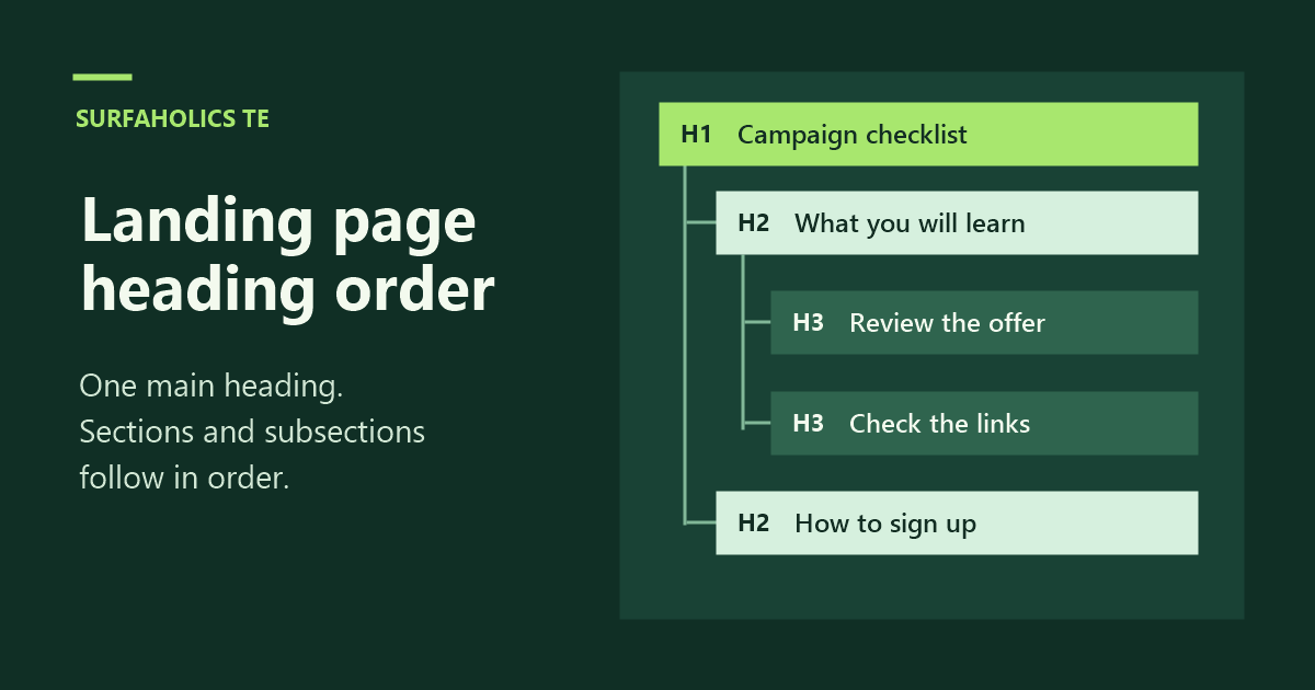
A typical landing page might use one main H1 heading for the offer, H2 headings for its principal sections, and H3 headings for subsections.
Check the structure, not just the appearance
Open the landing page and inspect its heading structure using browser developer tools or an accessibility-checking extension.
Look for headings that describe the sections accurately. Check whether the hierarchy makes sense when read in order.
A heading should not be chosen merely because its default font size looks attractive. Use CSS to control appearance while preserving the appropriate heading level.
Watch for confusing jumps
Suppose a page begins with an H1 called “Advertising Campaign Checklist,” followed by an H2 called “What You’ll Learn.”
If the next major section suddenly uses H4, ask whether two heading levels were skipped for a meaningful structural reason or simply for visual styling.
Skipping a level is not automatically an accessibility failure, but a logical hierarchy generally makes the document easier to navigate.
Try a screen reader
If possible, test the page with an actual screen reader such as NVDA, VoiceOver or another tool available to you.
Use its heading-navigation commands to move through the document. Can you identify the offer, important conditions and signup instructions without reading every paragraph?
Automated tools can identify some structural issues, but they cannot fully judge whether a heading is meaningful or whether the page makes sense to a person.
Review the call to action
Headings should help visitors reach the relevant information. They should not replace properly labeled buttons, form fields or links.
A well-structured page still needs a clear signup process and accurate information about what the visitor will receive.
A useful final check
Before assigning advertising credits, review the heading hierarchy, test the page with keyboard navigation, and check the experience with a screen reader when possible.
A clear structure benefits visitors who use assistive technology and often makes the page easier for everyone to understand.
The goal is not to add more headings. It is to help people find the information they came for.